Analyze Data Science Market
Contents
9.1. Analyze Data Science Market#
The data in this section is collected from 160k+ data scientists, 570k data analysts, 100k+ data engineers, and 19k+ machine learning engineers from all over the world using Diffbot, the world’s largest knowledge graph. Find more instructions on how to use Diffbot here.
I uploaded the dataset used in this tutorial to this repository so that you can try out the dataset yourself.
9.1.1. Find Top Most Popular Languages#
!pip install observable_jupyter
What are the top languages used by data scientists, data analysts, data engineers, and machine learning engineers? I answered this question using the data consisting of the top 100 most popular skills of people who have these job titles.
from observable_jupyter import embed
import pandas as pd
Start with loading the dataset:
skill_count = pd.read_csv(
    "https://media.githubusercontent.com/media/khuyentran1401/dataset/master/data_science_market/all_skills.csv",
    index_col=0,
)
skill_count.head(10)
| count | skill | Title | |
|---|---|---|---|
| 0 | 131292 | teaching | Data Scientist |
| 1 | 113898 | economics | Data Scientist |
| 2 | 106630 | programming language | Data Scientist |
| 3 | 105294 | mathematics | Data Scientist |
| 4 | 79871 | machine learning | Data Scientist |
| 5 | 79735 | python | Data Scientist |
| 6 | 77810 | robotics | Data Scientist |
| 7 | 70540 | software development | Data Scientist |
| 8 | 69262 | phython | Data Scientist |
| 9 | 62084 | data analysis | Data Scientist |
Next, we will visualize the dataset using a bubble matrix created on Observable.
A bubble matrix uses sizes and colors to represent two-dimensional information. The rows represent the job titles and the columns represent the languages. The bigger a bubble is, the more frequently the language is used in a certain job category.
The bubbles are highlighted if they are above a certain number of occurrences. You can use the slider to choose the threshold above which the bubbles are highlighted. For example, if you choose the threshold to be 100k, only the bubbles with a count above 100k are colored dark purple.
embed("@khuyentran1401/languages-between-jobs", cells=["chart", "viewof options"])
To sort the bubbles by a specific job title, click that job title.
Based on this plot, we can see that:
The top 3 skills of data analysts in descending order are SQL, Python, and R
The top 3 skills of data engineers in descending order are SQL, Python, and Java
The top 3 skills of data scientists in descending order are Python, R, and SQL
The top 3 skills of machine learning engineers in descending order are Python, Java, and C++
9.1.2. 10 Most Popular Majors of Data Professionals#
What are the top most popular majors of data professionals? To answer this question, we will download the data that shows the frequency of the top majors of a certain position.
!wget -c -O 'data/majors_df.pkl' 'https://github.com/khuyentran1401/dataset/raw/master/data_science_market/majors_df.pkl'
import pandas as pd
from IPython.core.pylabtools import figsize
import matplotlib.pyplot as plt
figsize(12, 8)
df = pd.read_pickle("data/majors_df.pkl")
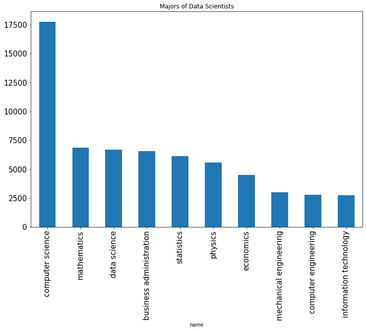
Top majors of data scientists:
df["data scientist"].plot.bar(x="name", y="value", legend=False, fontsize=15)
plt.title("Majors of Data Scientists")
plt.show()
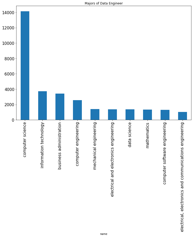
Top majors of data engineers:
df["data engineer"].plot.bar(x="name", y="value", legend=False, fontsize=15)
plt.title("Majors of Data Engineer")
plt.show()
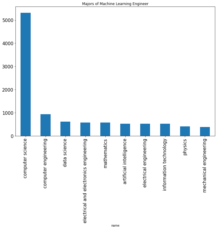
Top majors of machine learning engineers:
df["machine learning engineer"].plot.bar(x="name", y="value", legend=False, fontsize=15)
plt.title("Majors of Machine Learning Engineer")
plt.show()
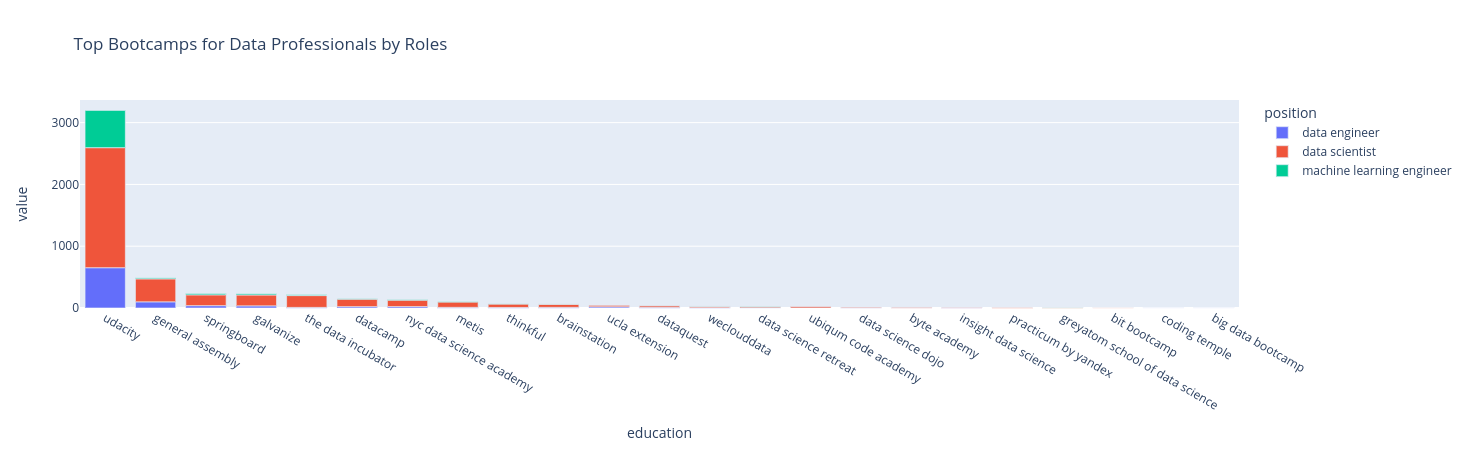
9.1.3. Top Data Science Bootcamps for Data Professionals#
Have you ever been frustrated when seeing hundreds of data science bootcamps to choose from on Google? Instead of choosing a random one, wouldn’t it be nice if you can find which bootcamps most data scientists took?
I analyzed the profiles over 5k data professionals to figure it out. The chart below shows the most popular bootcamps by roles from the analysis.
!wget -c -O 'data/bootcamps.pkl' https://github.com/khuyentran1401/dataset/blob/master/data_science_market/bootcamps.pkl?raw=true
import pandas as pd
import plotly.express as px

df = pd.read_pickle("data/bootcamps.pkl")
fig = px.bar(df, x='education', y='value', color='position', title='Top Bootcamps for Data Professionals by Roles').update_xaxes(
    categoryorder='total descending')
fig